Overview
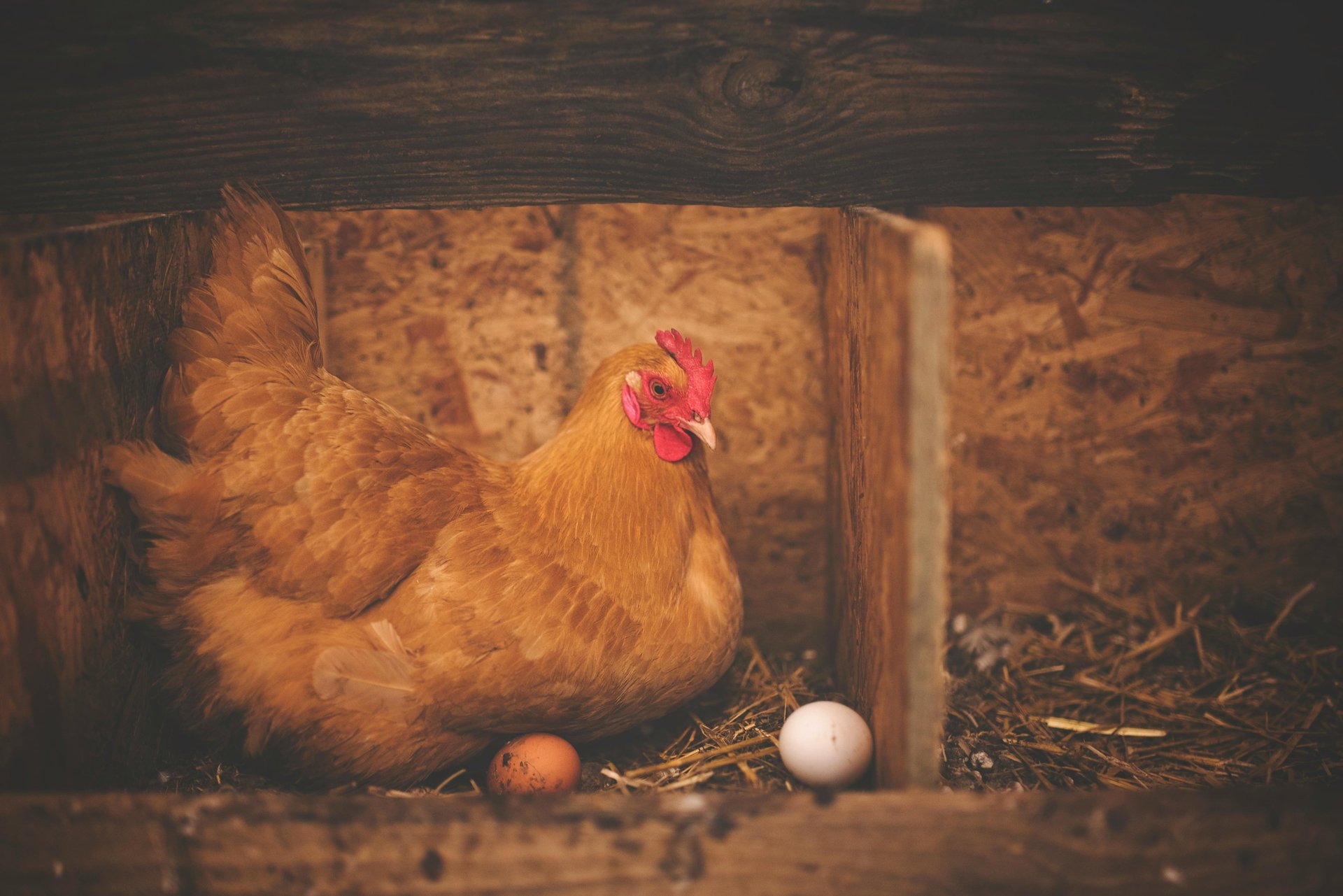
MKW is a young poultry farm business based in the heart of Ga-Hlahla, a small township in Limpopo, South Africa. Ga-Hlahla is a predominantly poor community, and we were excited by the opportunity to make a meaningful impact—one that could change lives.
ELEGANCE
Mrs. TS had a taste for the finer things in life. Her sophistication was subtle yet unmistakable, lending her a quiet but dignified presence.
Her voice carried no trace of doubt or hesitation. She knew exactly what she wanted and was prepared to make the necessary sacrifices to achieve it.
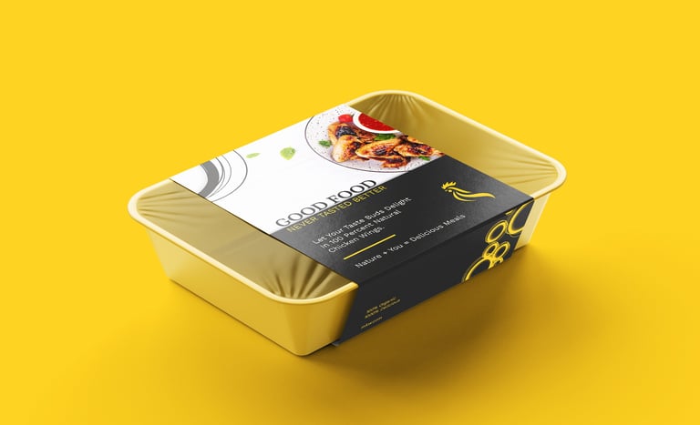
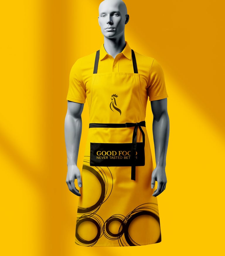
She wanted a design that was clean and elegant yet grounded—essentially, a premium look that remained accessible to the underprivileged.
DESCIPLINE
GENEROSITY
Owned by a lively Tsonga woman who, at first glance, has an intimidating presence but is, in reality, a determined and down-to-earth individual deeply rooted in Christian values, MKW Farms stood apart from its competitors—not for its branding, but for its bold ambitions. Despite being in an area crowded with similar businesses, its vision was audacious. Unfortunately, the same could not be said about its branding. It lacked character—the logo was an obvious template from a free site, the color palette was dull, the font uninspired, and there was no clear tone or identity. We had our work cut out for us. A challenge had been laid before us, and with complete creative freedom to transform it, we eagerly embraced the opportunity.
From the discovery, three things stood out.
Step 1
The Research!
We conducted an in-depth study of MKW’s competitors—and there were plenty. In Ga-hlahla and its neighboring areas, poultry farming was a thriving industry. With growing distrust in big-name brands and their processed poultry products, small towns and developing communities had witnessed a staggering rise in independent poultry farms. Our goal was clear—to craft a brand that would position MKW as a shining beacon, setting the standard for other poultry farms. True authority is achieved when others look to you as the benchmark for excellence.
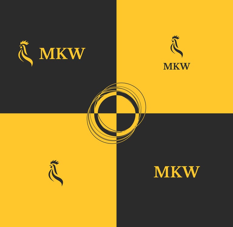
As with all our branding projects, first is the logo.
At Kotei Designs, we believe that every brand is a unique identity. What does this mean? Instead of merely analyzing the competition to create something that stands out, we focus on the brand itself—building from the inside out. We prioritize internal factors over external influences to craft a brand that is authentically yours. Your future is shaped by your vision, not your competition.
In MKW Farms case we were going for three things...
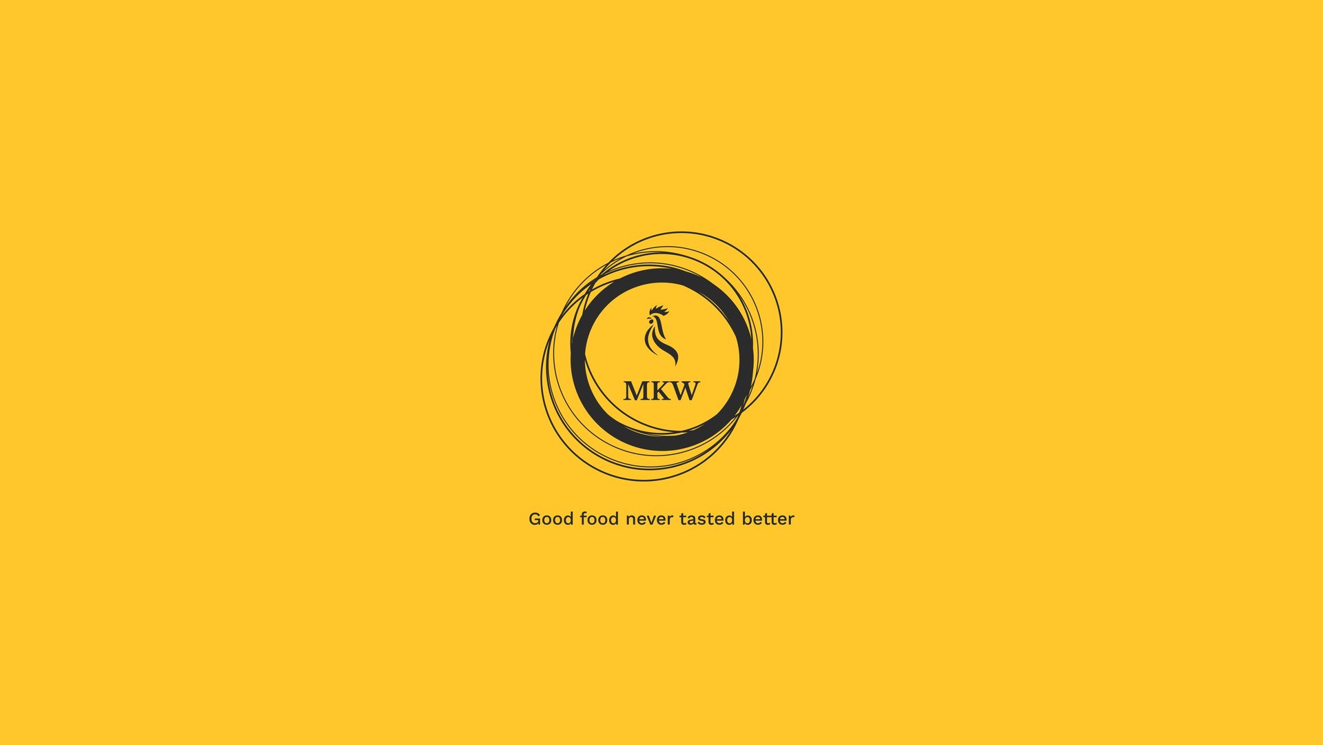
1. Elegance
A premium design with a sleek and sophisticated finish.
Simplicity is the ultimate sophistication.
A premium look that remains accessible, even to the less privileged.
2. Minimal
3. Down to earth

To be honest, we thoroughly enjoyed designing this logo. We had a clear vision from the start—a design perfectly tailored to the brand.
We weren’t aiming to win any awards with this one—simplicity was the goal. Our focus was on creating a design that was clean, recognizable, and effective. The logo itself didn’t need to be radically different; rather, its true impact came from how it worked in harmony with the color palette, fonts, and brand voice to create a distinctive and memorable aesthetic.
We immediately fell in love with this design—so much so that we decided to forgo the usual three-concept approach. We had a clear understanding of what the client wanted, so we went all in. Not surprisingly, she loved it.
Our goal was elegance, simplicity, and a down-to-earth feel—and we nailed it. Then she told us that the simplicity and uniqueness reminded her of her hometown, Giyani. We’re not sure how we pulled that off, but we’ll take it.
'You have reignited my passion for poultry farming,' she said.
That’s two for two—we should probably stop here before we jinx it.

As for the color palet
Given Mrs. TS’s deep love for her Tsonga culture, we seriously considered incorporating a refined selection of Tsonga colors. However, the market was already saturated with brands using the same palette. MKW isn’t here to compete for a spot—it’s here to take over. So, instead, we chose colors that hold strong directional and descriptive significance, particularly within Black South African culture.
What do we mean by this?
#ffc72c
#2b2b2b
We chose a vibrant golden yellow—radiating warmth and energy, often linked to optimism and creativity. In the Christian community, it also symbolizes wealth. For the second color, we opted for a deep charcoal gray, exuding a sleek, modern, and sophisticated feel with a subtle touch of mystery. Across many cultures, this shade is also associated with humility.
Essentially, we aimed for elegance, sophistication, and a grounded feel—while staying true to Mrs. TS’s beliefs. And we nailed it. Suffice to say, she loved it. Designing this brand was pure enjoyment—everything just fell into place.
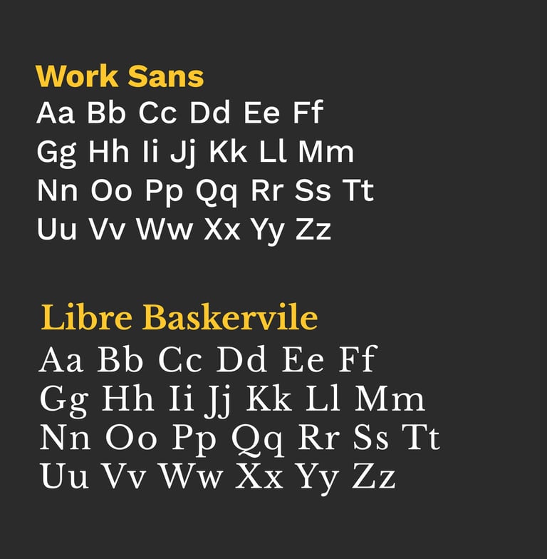
Next on the line up is the font.
At first, we took the classic approach—using one font for headlines, another for sub-headlines, and yet another for body text. But it ended up feeling cluttered and disconnected, all over the place.
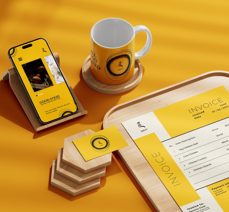
After putting our heads together, we decided to simplify things with just one font: Work Sans. It’s modern, minimalist, and highly legible, perfect for both digital and print. It embodied the elegance, simplicity, and readability we were after—essentially, it wasn’t trying too hard.
For the logo font, we chose a serif font, Libre Baskerville, for one simple reason—it just fit. Classic, elegant, and timeless.
Now came the fun part, putting it all together.
For designers, nothing brings more joy than the process of crafting a brand. To most, it’s just colors and logos—but to us, it’s about creating an emotional connection with customers, transforming the dreams and visions of brand owners into reality. The look of amazement and awe on our clients' faces when they see the final design is the icing on the cake. We thoroughly enjoyed designing MKW Farms’ brand, and we’re proud to say the client was blown away.